Fit Results Graphs
The Fit Results graph area can be used to analyze the results of the fitting process in several ways, including the Fit Comparison Graph which displays a comparison of each fitted distribution against the data set and, if selected in the fit configuration, the results of the Fit Bootstrap.
The Graph and Information Panels function the same as graphs in any other @RISK windows, and are covered in more detail starting in Graphing in @RISK.
The default view of the Fit Results window is the Comparison Graph; the other graphs can be viewed using the Command Buttons at the bottom of the window. The graphs available for analysis of a fit are covered under the Fit Results Command Buttons section.
Fit Comparison Graph
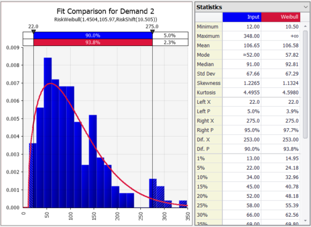
Figure 1 - Fit Comparison Graph
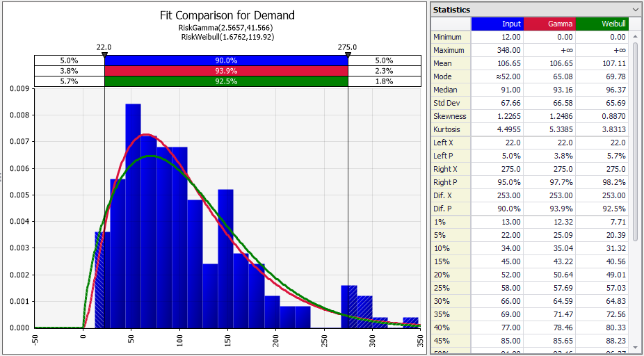
Figure 2 - Fit Comparison Graph, Multiple Distributions
The Fit Comparison Graph (Figure 1, right) displays two curves when the Fit Results first opens - the distribution of the sample data and the best fit distribution as an overlay (based on the ranking method chosen - see Fit Ranking Methods). Additionally, the @RISK function (or functions) displayed in the comparison are detailed beneath the graph title, including the parameters. Lastly, the statistics for both the same data and the selected distribution are displayed in the Information Panel to the right of the graph.
Comparisons from multiple fitted distributions can be viewed simultaneously by checking the box next to a distribution name in the list to the left; when multiple distributions are viewed (Figure 2, right), each distribution is overlaid in a different color with the corresponding delimiter and statistics header in the same color. The additional @RISK functions are also displayed below the graph title.
Probability-Probability Plot
The Probability-Probability Plot (or P-P Plot as it is common called) is a method of graphing the cumulative distribution of the data set (X-axis) against the cumulative distribution of the selected fitted distribution (Y-axis). In this graph, the closer a distribution fits to the data, the closer it will be to a straight line.
As with the Fit Comparison graph, when multiple fitted distributions are selected from the list of distributions, each is displayed in its own colored line and the @RISK functions are added below the graph title.
Quantile-Quantile Plot
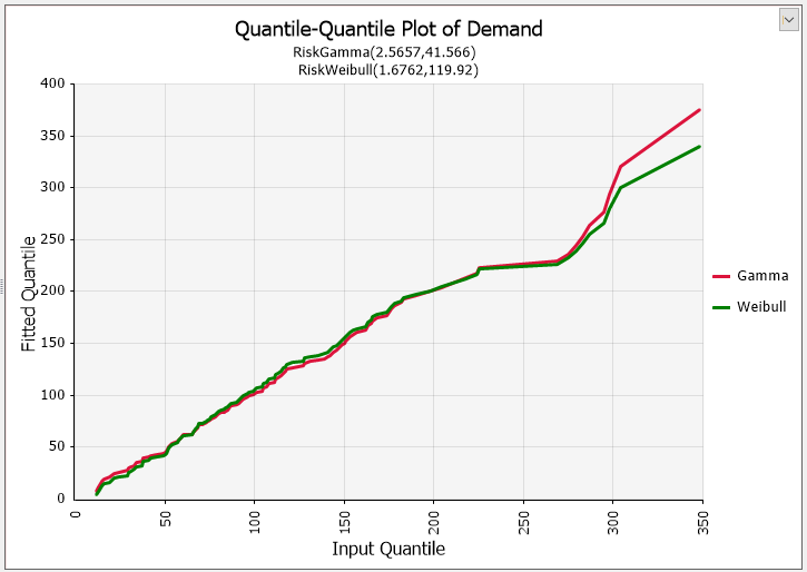
Figure 3 - Quantile-Quantile Plot
Similar to a Probability-Probability Plot, a Quantile-Quantile Plot (or Q-Q Plot, Figure 3, right) compares the data set (X-axis) to the fitted distribution or distributions (Y-axis); and as with the P-P Plot, the closer a Q-Q Plot's graph is to linear (where x=y), the better the fit of the fitted distribution. However unlike the P-P Plot, this comparison uses the quantiles of each distribution.
As with the Fit Comparison graph, when multiple fitted distributions are selected from the list of distributions, each is displayed in its own colored line and the @RISK functions are added below the graph title.