Summary Boxplots
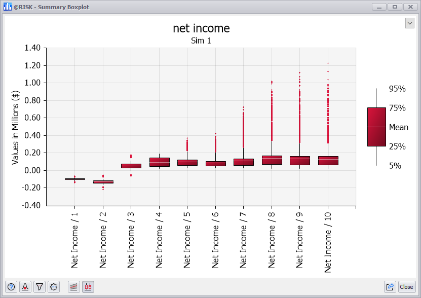
Figure 1 - Summary Boxplot Graph
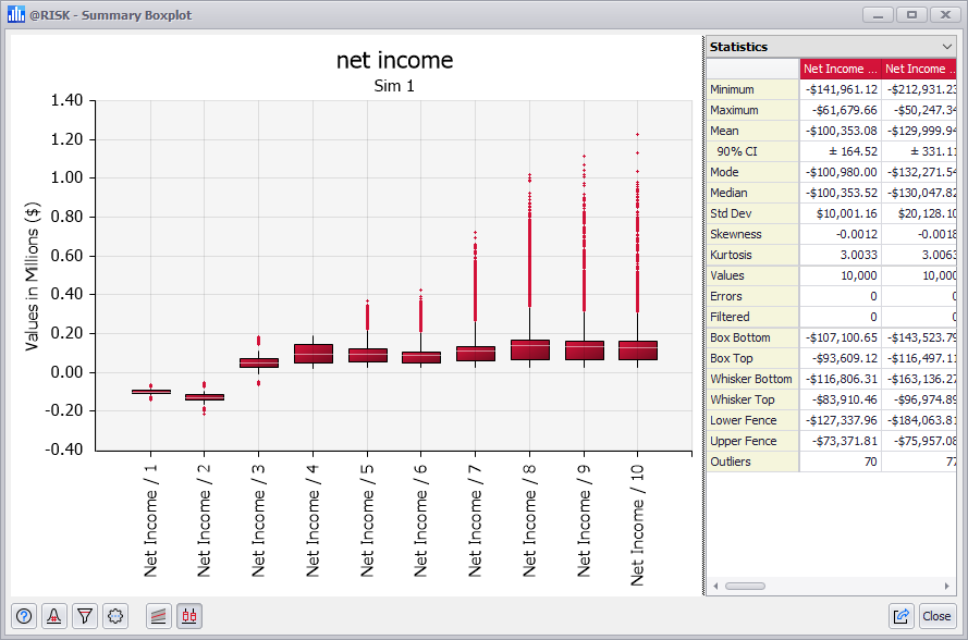
Figure 2 - Summary Boxplot with Statistics Grid
A Summary Boxplot (Figure 1, right) summarizes changes across multiple probability distributions. Boxplots of simulation results can be created from the Explore Menu or Results Summary window.
The boxplot takes five parameters from each distribution: one measure of central tendency (the mean, mode, or median) plus two upper and two lower percentile values and graphs how these five parameters change across the set of distributions. The inner two percentiles are called the “box” while the two outer percentiles are called the “whiskers.”
Additionally, the graph can be configured to display outlier data points as demonstrated by the red plus ("+") symbols in Figure 1. Outliers are the data points for each distribution that fall outside the range of the boxplot (e.g. less than the 5th percentile or greater than the 95th percentile).
A Summary Box Plot graph is especially useful in displaying trends such as how risk changes across time. For example, if a range of 10 output cells contain Cash Flow in years 1 through 10 of a project, a box plot for this range shows how the risk changes across the 10-year period.
Select Legend View
The Summary Boxplot window includes options for changing the graph legend using the pulldown menu in the upper right corner of the window, including a box-whisker legend (Figure 1, right) and a Statistics Grid (Figure 2, right). The options available are:
Box Plots Across Multiple Simulations
If displaying a graph across multiple simulations, multiple copies of the box plot are shown side-by-side (Figure 2, below).
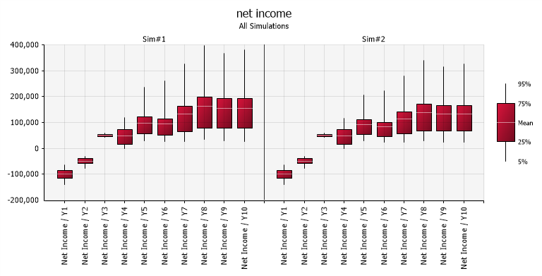
Figure 3 - Summary Box Plot Graph - Multiple Simulations