Distribution Graphs

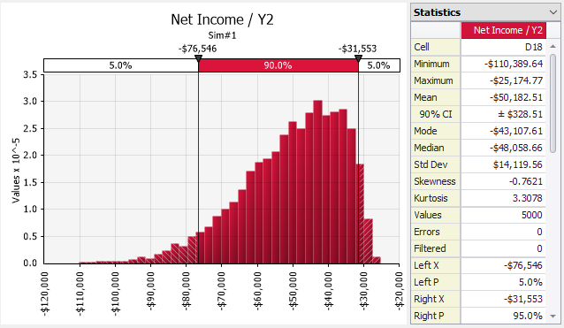
Figure 1 - Distribution Graph with Statistics

A distribution graph shows the range of possible outcomes and their relative likelihood of occurrence. Distribution graphs are displayed in many @RISK windows and graphs, including the Define Distribution Window, the Browse Results Window, and the @RISK Data Viewer.

Distribution Display Formats

Distribution graphs can be displayed in several “display formats” which control how the distributed nature of the data is displayed.

  • Automatic – The automatic display format, the default, indicates to @RISK that it can decide what display format to use based on the context of the element. For example, for simulation result data from a continuous source, a Probability Density histogram will be chosen; data from a discrete source will use the Discrete Probability option; the graph of a RiskCumul function, the Cumulative Ascending format is used; and so forth.
  • Probability Density – For simulated data, this graph displays distributions as histograms, with the y-axis values computed as the number of values in each bin divided by the width of the bin. Continuous theoretical distributions are displayed based on their probability density function.
  • Discrete theoretical distribution cannot be displayed with this format.

  • A big advantage of this choice is that histograms of simulated results can be overlaid with theoretical distribution curves on the same scale.

  • Relative Frequency – For simulated data, displays distributions as histograms, with the y-axis values computed as the percentage of values that fall in each bin. Continuous theoretical distributions are artificially binned and will also show as a histogram.
  • Discrete theoretical distribution cannot be displayed with this format.

  • Discrete Probability – For simulated data or discrete theoretical distributions, displays data as discrete values. The y-axis is the percentage of values occurring at each specific value.
  • Continuous theoretical distributions cannot be displayed with this format.

  • Cumulative Ascending – Displays distributions as cumulative probabilities, where the y-axis shows the probability of obtaining a value less than or equal to the corresponding x-axis value.

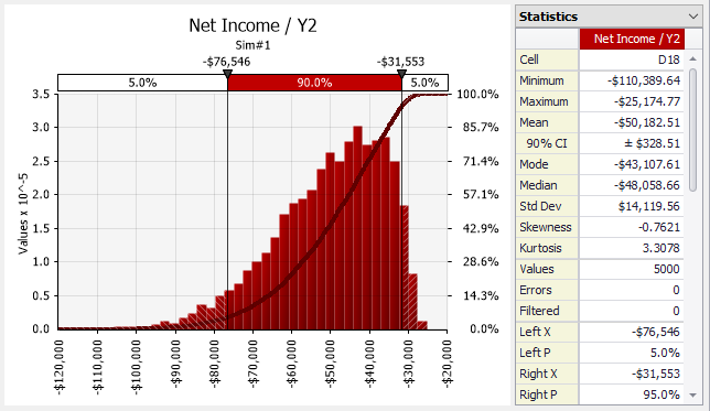
Figure 2 - Distribution with Cumulative Overlay

  • Cumulative Descending – Displays distributions as reverse cumulative probabilities, where the y-axis shows the probability of obtaining a value more than the corresponding x-axis value.
  • Cumulative Overlays - Sometimes it is useful to display a histogram and a cumulative curve for a given output or input on the same graph. This graph type (Figure 2, right) has two Y-axes, one on the left for the histogram and a secondary Y-axis on the right for the cumulative curve.

Histogram Binning

In order to display simulation data in a useful format, the data must often be converted into a histogram. This involves dividing the range of the data into a set of “bins” and computing how many values fall within each bin.

@RISK will do this procedure automatically, but in some circumstances more control over the binning process might be desirable. The Distribution Tab of the Graph Options dialog has settings for changing the graph binning.