Graphing Preferences
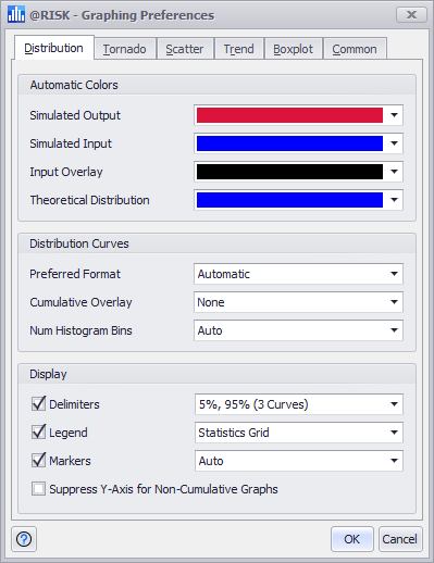
Figure 1 - Graphing Preferences Window
The Graphing Preferences window (Figure 1, right) contains default settings for how the various @RISK graphs should be configured by default. These configurations can be changed for individual graphs through the options available in the window where the graph is displayed (e.g. the Define Distribution window or the Browse Results windows). The configuration options include color preferences and other options for each of the major graph types.
Please note: a full breakdown of every option is not covered in this topic. For more information on working with graphs in @RISK, see Graphing in @RISK.
The graphing preferences dialog has six tabs. The last of these tabs, the Common tab, contains a few options that apply to every graph. The other five are associated with the major types of @RISK graphs:
Each graph type has one or more 'Automatic Colors' associated with it. These indicate what color should be used for a graph curve, assuming that curve’s formatting has been left in its automatic mode. Additionally, there are other options associated with each graph type - for example, the 'Preferred Format' option in the Distribution tab determines if distributions should be displayed in a Probability Density format, a Cumulative Ascending format, etc.
A graph that has already been created will often not respect changes to these preferences. In those cases, it may be necessary to reset those graphs to use defaults to make updated preferences take effect.