Define Time Series Window

Figure 1 - Time Series
Defining a time series model is very similar to defining other probability distributions; the Define Time Series window (Figure 2, below) provides a graphical interface for configuring an @RISK time series function. There is one significant difference, however - for a time series model, @RISK creates an array function, which by default will occupy a range of 24 cells starting with the cell that was active when clicking the Time Series button. The number of cells, along with the specific model, any applied transformations, and synchronization can then be configured in the Define Time Series window.
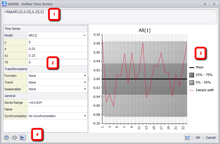
Figure 2 - Define Time Series Window
Define Time Series
The Define Time Series Window consists of the following primary sections:
- Formula Bar
- Configuration Panel
- Graph Panel
- Command Buttons
Time Series Graph
The graphing area of the Define Time Series window is a visual representation of the selected time series model as it is currently configured; the graph is one example of a Summary Trend Graph, another of which is available from the Explore Menu. This includes upper and lower bounds in gray (assuming default color settings) as well as the sample path of the projected data values in red. If synchronization has been selected, the historical data will be graphed as a blue line. There are a number of options and tools available specifically for the time series graph; see Define Command Buttons for more information.
The Graph Panels are used throughout @RISK, and are covered in more detail starting in Graphing in @RISK.