Fit Time Series Results
Similar to a standard fit, when a time series fit is complete the results will display in a new window (Figure 1, below). By default, the results of the fit are sorted with the most appropriate time series model listed at the top; the method used to determine the appropriateness of each model will be displayed in the column header (e.g. 'AIC' or 'BIC'), and any models that could not be fit for any reason will be displayed at the bottom of the list with a result of 'N/A'.
The selected @RISK time series model function will be displayed below the graph name, including the parameters required to produce data similar to the data set used in the fit. The graph will display the data used in the fitting process as a blue line (historical data), the sample path of the fitted time series model as a red line, and the percentiles of the distribution as gray areas representing the possible range of values. Depending on the configuration of the fitting process, the projected data will either begin alongside the historical data (when the option 'Series' Starting Point' is set to 'First Value of Dataset') or at the end of the historical data (when the option 'Series' Starting Point' is set to 'Last Value of Dataset').
To view the results of a fitting process for a specific model, click the model name in the list; the graph will update to show the results of that fitting.
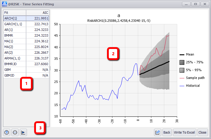
Figure 1 - Time Series Fit Results
Time Series Fit Results
The Fit Time Series results window consists of the the following primary components:
- Model List
- Graph and Legend
- Fit Results Command Buttons