X-Axis & Y-Axis Tab

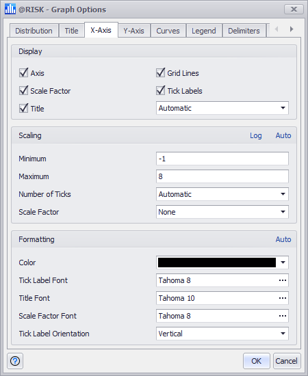
Figure 1 - Graph Options X-Axis Tab

The options on the X-Axis and Y-Axis tabs specify the scaling, axis titles, and corresponding formatting that will be used in the graph.

The options available are: 

  • Display - This option group controls which parts of the axis will be displayed on the graph.
  • Title - The axis title is the descriptive text that appears next to the axis. If this is not manually changed, @RISK will automatically choose a value based on the details of what is being graphed. If it is modified, it can be reset to its default by choosing 'Automatic' from the drop-down menu.
  • Scaling - This option group controls the extent of the axis and how many ticks marks should be displayed. Unclick the Auto button in the upper right corner to override the scaling options.
  • Please note: axis scaling directly on the graph by dragging the limits of an axis to a new minimum or maximum position.

  • The 'Log' button will change the graph to use a log-scale. This will only work correctly if all the values on the graph are positive numbers.

  • Scale Factor - The Scale Factor (e.g. thousands or millions) can be applied to the axis so that the values displayed are easier to read. @RISK will do this automatically, but its choices can be overridden. Scale factors can be “named” (“thousands”, “millions”, “billions”) or they can be numeric. A numeric scale factor is in terms of factors of ten. Thus a scale factor of 4 means all values will be divided by 104.
  • Formatting - The color and fonts used to display the titles can be changed in this group. Unclick the Auto button in the upper right corner to override the default formatting options.