Curves Tab
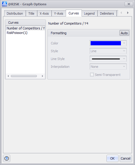
Figure 1 - Graph Options Curves Tab
The options on the Curves tab specify the color and style for each curve in the graph.
The definition of a “curve” changes depending on the type of graph. For example, for a distribution graph, the primary distribution and each of the overlays are curves. In a scatter plot, a single curve is associated with each X-Y data set pair shown in the graph. Clicking on a curve in the Curves list displays the available options for that particular selection.
The color and styles used to display each curve can be changed in the Formatting group. Unclick the Auto button in the upper right corner to override the formatting options.