Types of Graphs
In this section, the different types of graphs that can be made in @RISK are covered, along with some of the characteristics that distinguish them from other graphs.
The types of graphs available in @RISK are:
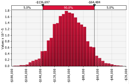
Distribution Graphs
A distribution graph shows the range of possible outcomes and their relative likelihood of occurrence.
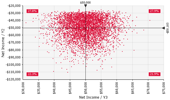
Scatter Plot Graphs
A scatter plot shows the relationship between the data values of two variables along two axes, potentially revealing any correlation between the two.
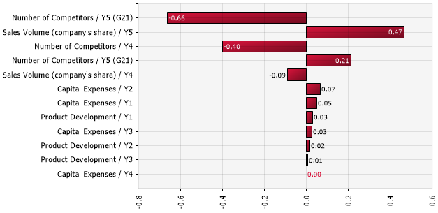
Tornado Graphs
Tornado graphs visualize either sensitivity analysis or scenario analyses, both of which are different ways of analyzing how the inputs in a model drive the behavior of the outputs.
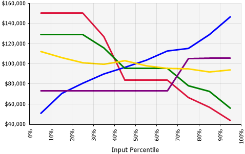
Spider Graphs
A spider graph shows how the value of an output statistic changes as the sampled input value changes.
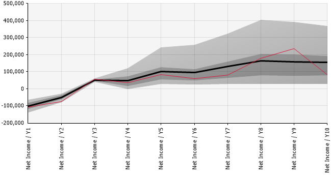
Summary Trend Graphs
A Summary Trend graph summarizes summarizes the values for a probability distribution displaying each distribution's central tendency (mean/mode/median) as the spread of values across two upper and two lower bands (either percentiles or number of standard deviations); when graphing multiple probability distributions the graph summarizes changes across those distributions.
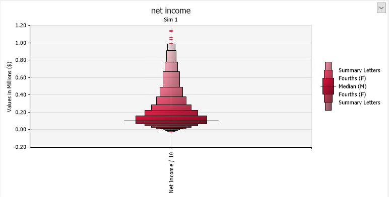
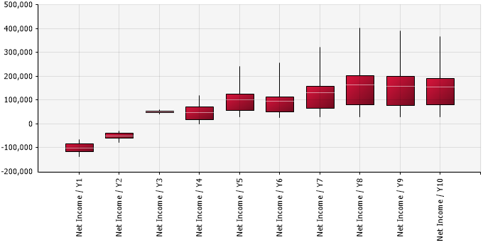
Summary Boxplot Graphs
A Summary Box Plot summarizes the spread of values for a probability distribution across several statistics (minimum, first quartile, mean/mode/median, third quartile, and maximum) as well as displaying outlier values; when graphing multiple probability distributions the graph summarizes changes across those distributions.
Summary Letter Value Graphs
A Summary Letter Value Graph summarizes symmetry of values at numerous levels beyond median and fourths (quartiles); when graphing multiple probability distributions the graph summarizes changes across those distributions.