Spider Graphs
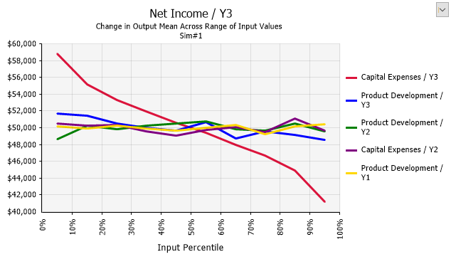
Figure 1 - Spider Graph
Spider graphs result from the Change in Output Statistic form of sensitivity analysis.
A spider graph shows how the value of an output statistic changes as the sampled input value changes. The steeper the line, the greater the impact of the input on the output. This shows more information than a tornado graph, at the expense of being more complicated. While a tornado graph shows only the overall change in the value of the output statistic, a spider provides information on the rate of change in output value as the input changes through its range.