Scatter Plot Graphs
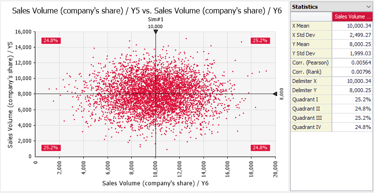
Figure 1 - Scatter Plot with Statistics
A scatter plot shows the relationship between the data values of two variables. Scatter plots can be made in @RISK using the Explore menu, by drag-and-drop on a tornado graph bar, and from the Sensitivity Window or Scenario Window.
Standardization of Data Values
In some cases it is convenient to “standardize” the data shown in a scatter graph. This cause the values on the graph to be transformed into the number of standard deviations away from the mean, optionally for either or both the x- or y- dimension. Standardization is especially useful when overlaying scatter plots from different input distributions. This allows a common scale between the inputs, making comparisons easier.
Standardization can be configured in the Scatter Tab of the Graph Options dialog.
Confidence Ellipses
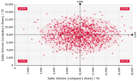
Figure 2 - Scatter Plot with Confidence Ellipse
It is possible to add a confidence ellipse around the data values of a scatter graph. This ellipse shows, assuming bivariate normally distributed data, a confidence region of the graph with a configurable confidence level.
The ellipses can be configured in the Scatter Tab of the Graph Options dialog.
Scatter Plot Delimiters
Scatter plots have a 2-dimensional set of delimiters that can be used to show the percentage of the values that fall in each of the delimited quadrants of the graph. If overlays have been added to a scatter plot, the percentage values for each plot are color coded. The Delimiters Tab of the Graph Options dialog controls the details of how these delimiters are displayed.