Advanced Sensitivity Analysis Results
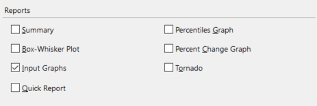
Figure 1 - Report Options - Advanced Sensitivity Analysis
The reports available for an Advanced Sensitivity Analysis include a summary report, a quick report, and several types of graphs. Each of the report options detailed below correspond to an option available in the Advanced Sensitivity Analysis Options window, under the 'Reports' section (Figure 1, right). Below are details on the various types of reports that can be generated.
Summary Report
A Summary (Figure 2, below) describes the stressed inputs, and lists the corresponding statistics of the monitored output: Mean, Minimum, Maximum, Mode, Standard Deviation, Variance, Kurtosis, Skewness, 5th Percentile, and 95th Percentile.
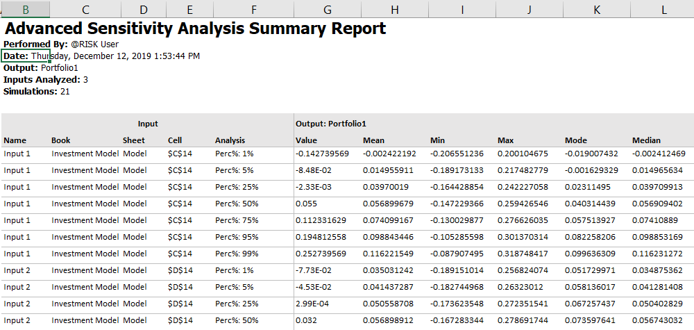
Figure 2 - Summary Report Example
Compact Report
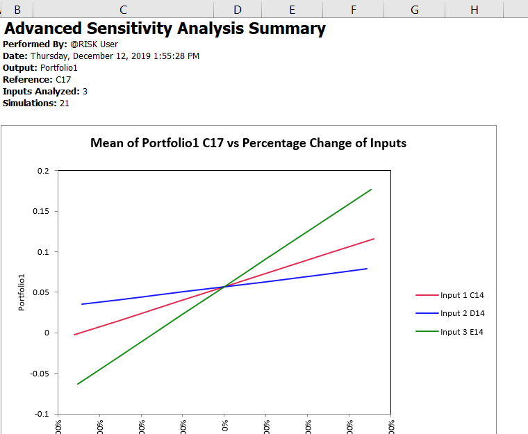
Figure 3 - Quick Report Example
A Compact Report (Figure 3, right) provides a single page-formatted summary of the Advanced Sensitivity Analysis results. This report is designed to fit on standard A4 paper and is ideal for printing. It includes the same graphs that are available separately through Advanced Sensitivity Analysis Options.
Selecting Compact Report when configuring the simulation will result in @RISK generating multiple worksheets - the primary 'Compact Report' worksheet as well as additional worksheets for each of the inputs included in the analysis. These additional worksheets are labeled 'CR' (for Compact Report) with the input name appended. Each additional sheet includes a Cumulative Distribution graph of the selected output at each of the analyzed values for the specific input, as well as detailed statistics for the input at each "step" in the Advanced Sensitivity Analysis.
Advanced Sensitivity Analysis Graphs
The purpose of the Advanced Sensitivity graphs are to enable comparing the results of the variations made to each input and how those variations affect the selected @RISK output. The available options are:
Input Graphs
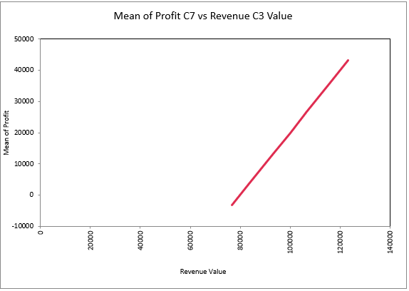
Figure 4 - Input Sensitivity Spider Graph Example
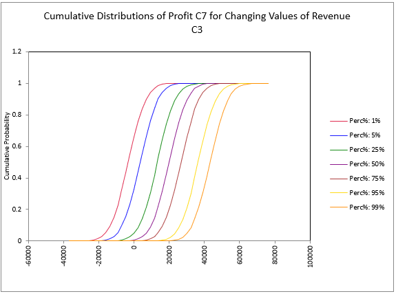
Figure 5 - Input Cumulative Distributions Example
The Input Graphs option for Advanced Sensitivity Analysis generates a worksheet for each input (or group of inputs, if they are configured together), each one labeled with the input name(s) and the cell reference(s). Each worksheet will include two graphs. The first graph (Figure 4, left) is a Sensitivity Spider Graph. The second is a Cumulative Distribution graph (Figure 5, right) showing how the selected output behaves for each "step" of the selected input or inputs.
Box-Whisker Plot
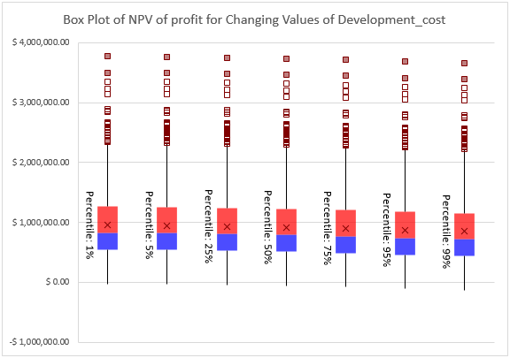
Figure 6 - Boxplot Graph Example
The Box-Whisker Plot option for Advanced Sensitivity Analysis generates a box plot graph (Figure 6, right) for the input at each of the "stepped" values used in the analysis. A box plot displays the summary of a set of data for five statistics - the minimum, first quartile, median, third quartile, and maximum. The box spans the first quartile to the third quartile, a vertical line marks the median, and the mean is marked with an 'X'.
Selecting this option together with the 'Input Graphs' option (above) will add the boxplot graph to the same worksheet as the other input graphs; if only 'Box-Whisker Plot' is selected, the worksheet will be labeled with the input name(s) and cell reference(s).
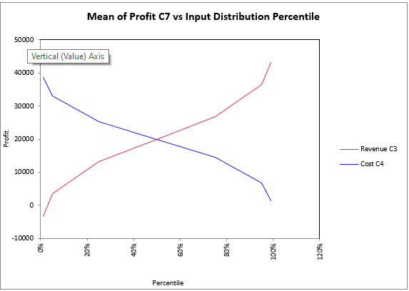
Figure 7 - Percentile Example
Percentiles Graph
The Percentile Graph (Figure 7, right) plots the output statistic against percentiles of each of the @RISK distributions that were selected for analysis with step type Percentiles of Distribution.
Please note: Only inputs that are @RISK distributions and have been analyzed using the 'Distribution Percentiles' variation method are displayed on this graph.
Percent Change Graph
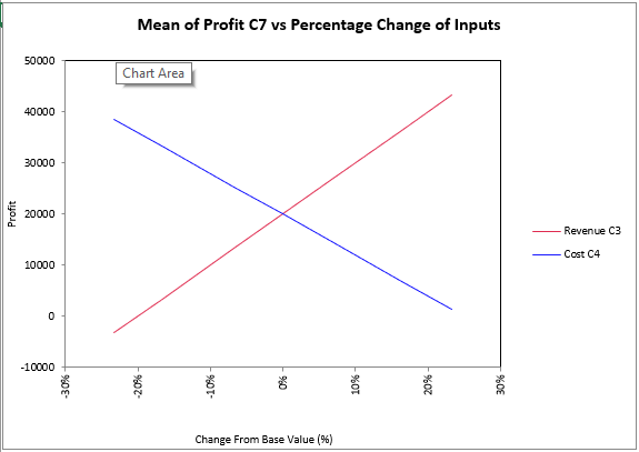
Figure 8 - Percent Change Example
The Percent Change Graph (Figure 8, left) plots the output statistic against each of the selected inputs calculated as a Percent Change from Base. The input value, listed on the X-axis, is calculated by comparing each input value tested to the base value for the input.
Tornado Graph
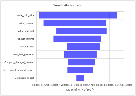
Figure 9 - Tornado Example
The Tornado Graph (Figure 9, right) shows a bar for each of the inputs defined for analysis, showing the minimum and maximum values of the specified output statistic as the input varies over its range.