Summary Trend Graphs
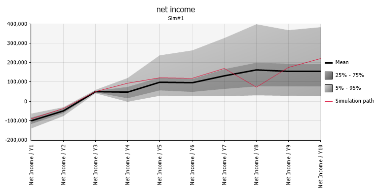
Figure 1 - Summary Trend Graph
A Summary Trend graph (Figure 1, right) summarizes changes across multiple probability distributions. Trend graphs of simulation results can be created from the Explore menu or Results Summary Window. Trend graphs also appear in graphs of both theoretical and fitted time series.
The Summary graph takes five parameters from each distribution: one measure of central tendency (the mean, mode, or median) plus two upper and two lower band values (either percentiles or number of standard deviations from the center) and graphs how these five parameter change across the set of distributions.
A Summary Trend graph is especially useful in displaying trends such as how risk changes across time. For example, if a range of 10 output cells contain Cash Flow in years 1 through 10 of a project, a Summary Trend graph for this range shows how the risk changes across the 10-year period. The narrower the band, the less the uncertainty about your cash flow estimates. Conversely, the wider the band the greater the possible variance in cash flows and the greater the risk.
Displaying Sample Paths and Sample Path Animation
Trend graphs can be adorned with a sample path to help illustrate the nature of the time-series. The sample path can also be animated, which means once per second a different sample path is chosen.
Trend Graphs Across Multiple Simulations
If displaying a trend graph across multiple simulations, multiple copies of the trend are shown side-by-side (Figure 2, below).
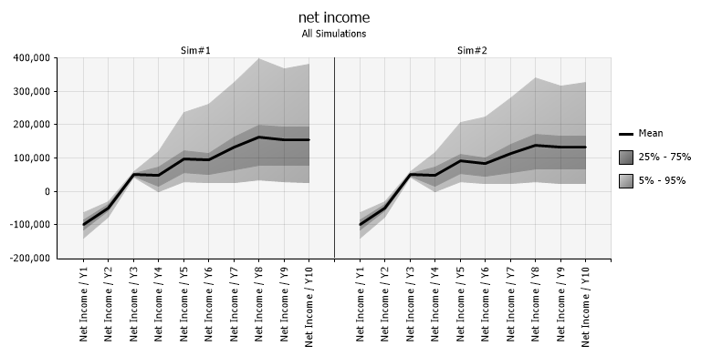
Figure 2 - Summary Trend Graphs - Multiple Simulations